Internal · noindex
Bike Net Kit design system
Live reference for color tokens, map layers, typography, and reusable UI components. Source of
truth is www/src/routes/layout.css. Keep DESIGN.md in sync with this page.
Downloads
Brand assets, design tokens, and this spec — ready to hand off.
Spec
The current DESIGN.md bundled with this build.
Read it in the preview below, or link to it at /DESIGN.md.
Design tokens
Resolved design tokens (0 colors + fonts, sizes & tracking) as JSON — values are computed
(incl. color-mix()) and ready for Python or other apps.
W3C is the Design Tokens Community Group
interchange format ($value / $type) that Style Dictionary, Tokens Studio and Figma
read. Flat is the older BikeNetKit-specific
shape, which also carries each token's --var name and raw CSS declaration.
Brand assets
Download as SVG (vector) or PNG (rasterized in-browser at the chosen scale).
Logos





Wordmarks



QR codes






Backgrounds
Tool logos
The horizontal lockup with the tool name in place of the wordmark — same font, size, spacing and color. Type is converted to outlines, so the files need no font to open.
Loading the brand font…
Color tokens
All values defined in layout.css @theme block. Reference via var(--color-…) or Tailwind utilities like bg-brand.
Base palette
Brand (semantic)
Ink (text)
Surfaces
Borders
Category palette
Used to color categorical groups in visualizations, e.g. superblockify classification IDs.
Hashed assignment; category-other is the unclassified fallback.
Existing network
Periwinkle baseline for already-built bike infrastructure, kept off the green ramp so that
stays exclusive to newly proposed links. LinkBikeNet distinguishes segments wired into the
largest connected component by saturation, not hue. Mirrored in $lib/colors.js for MapLibre paint.
Notice
Pale amber for a state the reader must not miss: a tool with no results for the city. Body
copy on it stays in the ink colors. Apply it through CardPanel surface="notice".
Visualization ramp
Maps
A quiet, self-hosted Protomaps basemap with the tool’s GeoJSON overlays on top. The network is the subject, and the basemap is there for orientation. Every specimen below is drawn from the constants the map itself paints with, so it changes when they do.
Layer stack
Top to bottom. Every overlay is inserted beneath overlayBeforeId() (address_label), so place names stay legible on top
of the network. Within a component, the declaration order is the drawing order.
Basemap · Labels — 14 layers
address_label · water_waterway_label · roads_oneway · roads_labels_minor · water_label_ocean · earth_label_islands · water_label_lakes · roads_shields · roads_labels_major · places_subplace · places_region · places_locality · places_locality_capital · places_country
- …-hulls-outline SuperBlockify · SuperblockLayers ink line, SUPERBLOCK_HOVER_WIDTH
- …-seeds-dots GrowBikeNet · BuildupLayers ink dots with white stroke, SEED_CIRCLE_RADIUS
- …-metric-dots, …-rank-labels FixBikeNet · StaticLayers ramp dots with white stroke, below DOT_LINE_CROSSFADE
- …-selection-outline, …-selection FixBikeNet · StaticLayers as hover, SELECTION_WIDTH_STEP wider
- …-highlight-outline, …-highlight all but SuperBlockify · BuildupLayers, StaticLayers StaticLayers: ink casing + own ramp color; BuildupLayers: flat ink, no casing
- …-hulls-boundary SuperBlockify (density mode) · SuperblockLayers density-ramp line, SUPERBLOCK_BOUNDARY_WIDTH
- …-metric, …-edges all · all three ramp line at quantile stops, width per tool, zoom-scaled
- …-hulls SuperBlockify · SuperblockLayers category-* fill (hashed), SUPERBLOCK_HULL_OPACITY
- …-existing GrowBikeNet (from_bikenw), LinkBikeNet, FixBikeNet, SortBikeNet · BuildupLayers, StaticLayers existingNetwork line, EXISTING_NETWORK_LINE_WIDTH at EXISTING_NETWORK_OPACITY
- …-plan SortBikeNet · BuildupLayers ink line, PLAN_UNDERLAY_LINE_WIDTH at PLAN_UNDERLAY_OPACITY
- …-context-dots, …-context-symbols GrowBikeNet (rail, school) · BuildupLayers theme.address_label grey; icons from CONTEXT_ICON_MIN_ZOOM
- city-boundary-line all · MapHost brand line, BOUNDARY_LINE_WIDTH at BOUNDARY_LINE_OPACITY
- city-boundary-mask-fill all · MapHost brand fill outside the city, BOUNDARY_MASK_OPACITY
Basemap · Street network — 38 layers
roads_tunnels_other_casing · roads_tunnels_minor_casing · roads_tunnels_link_casing · roads_tunnels_major_casing · roads_tunnels_highway_casing · roads_tunnels_other · roads_tunnels_minor · roads_tunnels_link · roads_tunnels_major · roads_tunnels_highway · buildings · roads_pier · roads_minor_service_casing · roads_minor_casing · roads_link_casing · roads_major_casing_late · roads_highway_casing_late · roads_other · roads_link · roads_minor_service · roads_minor · roads_major_casing_early · roads_major · roads_highway_casing_early · roads_highway · roads_rail · boundaries_country · boundaries · roads_bridges_other_casing · roads_bridges_link_casing · roads_bridges_minor_casing · roads_bridges_major_casing · roads_bridges_other · roads_bridges_minor · roads_bridges_link · roads_bridges_major · roads_bridges_highway_casing · roads_bridges_highway
Basemap · Ground — 18 layers
background · earth · landuse_park · landuse_urban_green · landuse_hospital · landuse_industrial · landuse_school · landuse_beach · landuse_zoo · landuse_aerodrome · roads_runway · roads_taxiway · landuse_runway · water · water_stream · water_river · landuse_pedestrian · landuse_pier
Basemap · Protomaps
One self-hosted PMTiles archive (PUBLIC_BASEMAP_URL), read
with range requests. The layers are a fork of Protomaps’ WHITE flavor in map-style/layers.js, recolored by map-style/theme.js. Glyphs are served from /fonts/maplibre/ in Public Sans Regular, Public Sans Bold and
Public Sans Italic. There is no sprite: the few icons are rasterized at runtime. Labels inside the
city are clipped to its boundary, and its own name is set in bold black.
Label tiers
| Layer | Matches | Constant | From zoom |
|---|---|---|---|
| places_subplace — city district | population_rank ≥ 8 | SUBPLACE_ZOOM.district | 12 |
| places_subplace — quarter | kind = macrohood | SUBPLACE_ZOOM.quarter | 13 |
| places_subplace — neighborhood | everything else | SUBPLACE_ZOOM.neighbourhood | 14 |
| roads_labels_major | major road names | ROAD_LABEL_MIN_ZOOM | 12 |
| roads_shields | motorway badges | ROAD_SHIELD_MIN_ZOOM | 14 |
| roads_labels_minor | minor road names | layers.js | 15 |
Palette
Greys throughout, so no basemap color can be read as data. 3 keys depart from the Protomaps base and are marked; never bring brand green or the ramp into the basemap.
map-style/theme.js · theme = { ...BASE_PALETTE, overrides }
GeoJSON overlays
Drawn at true pixel width for zoom 12 on the basemap’s white ground. Lines have round caps and
joins (ROUND_LINE_LAYOUT), and every width passes through withZoomScale().
Zoom scale
A 3px line, the default ramp’s widest, at four zooms. Thinner at the overview, much heavier at street level.
render-config.js · ZOOM_SCALE_STOPS
Metric line, per tool
Color and width both run up the ramp, placed at evenly spaced quantiles of the dataset’s metric, so the segment that matters most is the darkest and the widest.
line-paint.js · computeRampStops(), makeLinePaint() · tools.json renderConfig
Existing network
Periwinkle, deliberately off the green ramp, and thinner than any proposed link, so it reads as context beneath the result.
render-config.js · EXISTING_NETWORK_LINE_WIDTH, EXISTING_NETWORK_*OPACITY, PLAN_UNDERLAY_*
Hover & selection
A highlighted segment keeps its own ramp color, so pointing at it never costs the value. It is redrawn thicker over an ink casing, which separates even the palest stop from the basemap. A selection is the same treatment, a step wider. Shown at FixBikeNet’s widths.
render-config.js · max(HIGHLIGHT_LINE_WIDTH, top × HIGHLIGHT_WIDTH_FACTOR) = 6.4px, + SELECTION_WIDTH_STEP, casing ± HIGHLIGHT_OUTLINE_INSET
Points
Seeds are ink with a white ring, so they read over any line. Rail stations and schools are basemap-grey places, dots at the overview and icons from z13 (rail) and z14 (schools). FixBikeNet draws each gap as a dot below z13 and crossfades to lines by z15, numbering the top-ranked gaps.
render-config.js · SEED_CIRCLE_RADIUS, CONTEXT_*, DOT_MARKER_RADIUS*, DOT_RANK_TEXT_SIZE · context-icons.js
Superblocks
Each block a translucent hashed category fill, its streets in the same color. Filtered-out blocks fall back to category-other. Hover outlines a block in ink, above the labels.
SUPERBLOCK_HULL_OPACITY 0.15 · _EDGE_OPACITY 0.85 · _BOUNDARY_WIDTH 1.75 (density mode)
City boundary
A faint brand wash over everything outside the city, and a thin brand outline, both under every other overlay.
MapHost · BOUNDARY_MASK_OPACITY 0.05 · BOUNDARY_LINE 1px at 0.5
Live, per tool
The real /embed route for each tool, loaded as it scrolls into
view. These need the basemap and the data host.
Typography
Three families. Bespoke Sans for display, Public Sans for body and most labels & values, IBM Plex Mono for HUD telemetry and small counters only.
Bike Net Kit
Headline · text-2xl 600
Section heading · text-lg 700
CTA · text-sm 700 italic
Body — the quick brown fox jumps over the lazy dog. Body text uses Public Sans at the default size; paragraphs are capped at 30em for readability.
text-sm · used for secondary text, descriptions, and most UI labels.
text-xs · used for captions, "coming soon" labels, sub-labels.
Inline links in body copy always use .link —
check out the color tokens, or read the conventions. Never style a prose link with bare text-brand.
Inline links in body copy always use .link —
check out the color tokens, or read the conventions. Never style a prose link with bare text-brand.
link-quiet drops the resting underline for grids where every item is a link — hover to reveal it.
FRAME 0042 / 0128
text-2xs (0.625rem) — used only for HUD telemetry & small counters
Buttons & controls
Reusable button primitives in src/lib/components/ui/.
IconButton
Circular. variant="solid" (default) is
brand-filled, used as the play/pause control in PlaybackControl. variant="ghost" with size="sm" is the quieter companion used for its step
buttons.
<IconButton ariaLabel="Play"><IconButton variant="ghost" size="sm"><IconButton disabled>ToggleButton
Bordered square icon button with a pressed state. For compact on/off map overlays where
the icon alone carries the meaning — when it doesn't, use CheckboxControl instead.
<ToggleButton pressed onclick title>CheckboxControl
Native checkbox with a visible text label, for optional map layers that need naming (GrowBikeNet's seed points, the basemap labels). The whole label is the click target.
<CheckboxControl bind:checked label>ExternalLinkButton
Link with icon. Used for the "Paper", "Code", and "Docs" links on tool pages. icon accepts 'paper' | 'code' | 'docs' | 'external'; the external icon is unused on tool pages today (it was the
"Live demo" link back to the tools' old standalone prototypes) but stays available for a future
external-link pattern of that shape.
variant is 'outline' (above) or 'solid'. Solid carries the "Docs" and "Code" links
in a row under the commands, where they are the call to action after the commands; outline
carries a static tool's "Paper" and "Code" inside its citation card, where a filled button
would shout over the citation that is the point of the card.
Take action!
The one underlined button: the map toolbar's call to action, which opens a popover of TakeActionLinks for the current city. Ordinary
outline, white fill, a thick half-strength lime underline on the label. Icon-only below lg. The same list renders on each city page.
Badge
Pill badge for emphasis labels (e.g. "Recommended").
<Badge>CardPanel
Floating panel container used by map overlays. Four surfaces: paper (sand, default — control panels), white (map readouts), dark (brand-green identity/header panels; supply light child text), and notice (pale amber — the "not available" callout).
surface="paper"surface="white"surface="dark"surface="notice"SuperblockSizeFilter
SuperBlockify's map legend: size distribution as a histogram, plus a two-handle range slider that filters the blocks on the map. Both axes are log10 — block areas span three orders of magnitude — and the bars outside the selection fade. Drag the bar between the handles, or anywhere on the histogram, to slide the whole window at constant width; the handles still set each bound on their own, by pointer or keyboard.
400 potential superblocks
CTA link
Inline italic display-font link with chevron. Used inside ToolCard and similar cards.
Sidebar nav item
Used for active/inactive nav rows in (app)/+layout.svelte. Active row is filled brand;
inactive rows highlight on hover.
SegmentedControl
Pill container holding mutually-exclusive options. Used for variant / type / metric switchers on city and growbikenet pages.
Button-driven (local state)
Pass onSelect for in-page toggles.
Link-driven (route state)
Pass hrefFor when switching navigates to a different
URL.
Unavailable option
An option with available: false renders muted and italic,
and is not navigable — used where a city has no data for that axis value.
SelectMenu
The dropdown counterpart to SegmentedControl, for an axis with too many options for one row of pills — SortBikeNet’s orderings. Same options, same link- or button-driven modes; ControlPanel switches to it with dropdown.
The menu is portalled to body, so a scrolling rail or
the mobile sheet cannot clip it. An option with available: false renders muted and italic.
UI components
Live instances. Heavy components (HeroSection, AmbientHeroMap) are described in static blocks below.
CitySearch
Filterable city dropdown. Props: cities, href, placeholder, class. Matches city names and country names; an exact two-letter country code ( DK) narrows to that country, which is what clicking
a row's country chip does.
Type a letter to see the dropdown.
CountryChip
Two-letter country marker for city lists. Props: code, country, onclick, class. With onclick it is a button that filters the list
by country; without, an inert label.
PlaybackControl
Map timeline scrubber. Props: frame, total, isPlaying, onplay, onpause, onscrub, playbackMs. Rendered as a full-width panel at the bottom of the map sidebar. ‹ and › step the
playhead one frame, and holding one runs the timeline at playback speed — forward or in
reverse; the counter stacks "n" over "total" at a fixed width so the slider never shifts.
ToolCard
Three variants: active interactive (white bg), active static (sand bg),
and coming-soon (subtle bg, no link). The landing page passes active interactive
tools their questionAnswered as question, which replaces the description.
GrowBikeNet
Where should a bike network grow?
StretchBikeNet
Static tool card — read-only documentation page.
ExampleBikeNet
Coming-soon card — visually de-emphasized, non-interactive.
CityTeaser
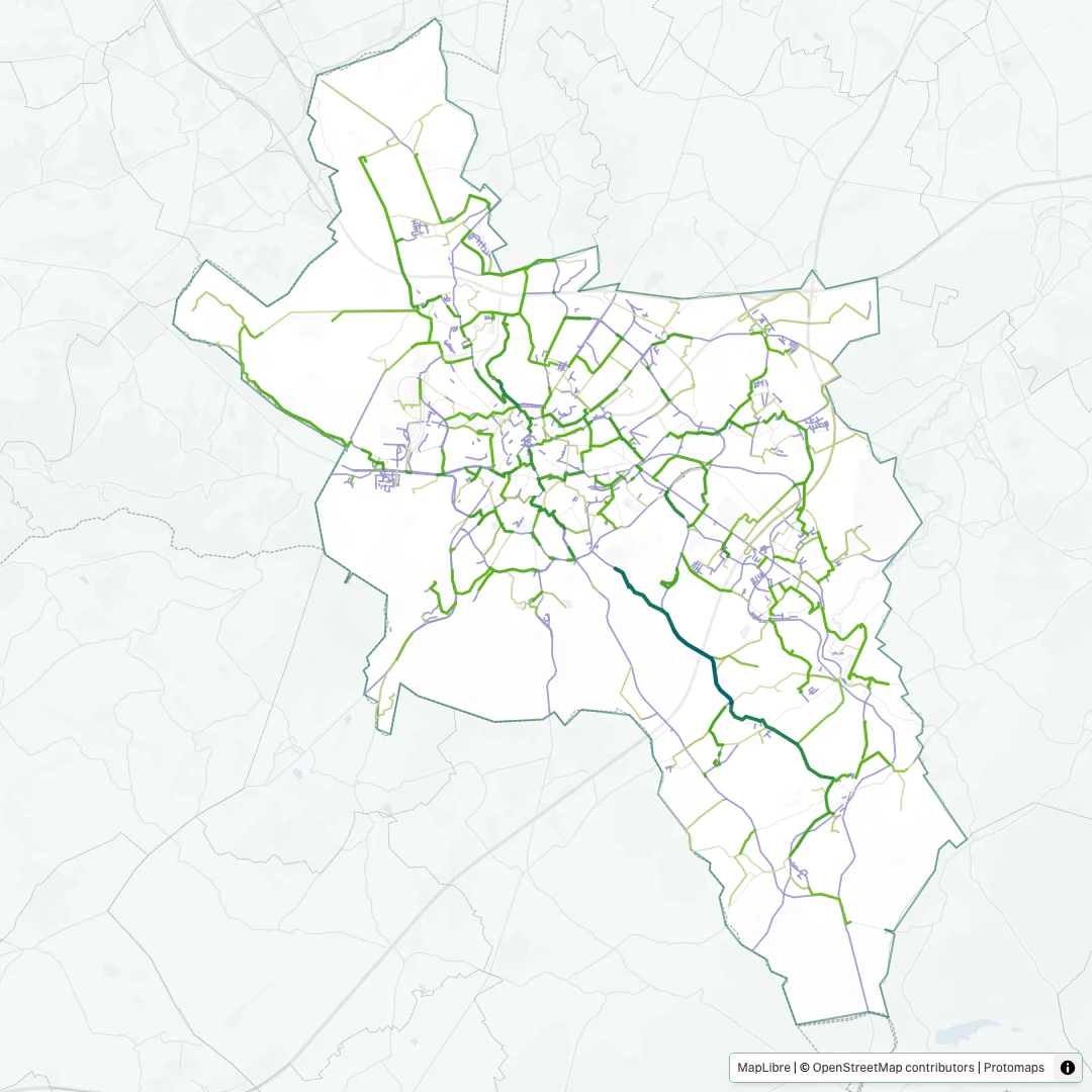
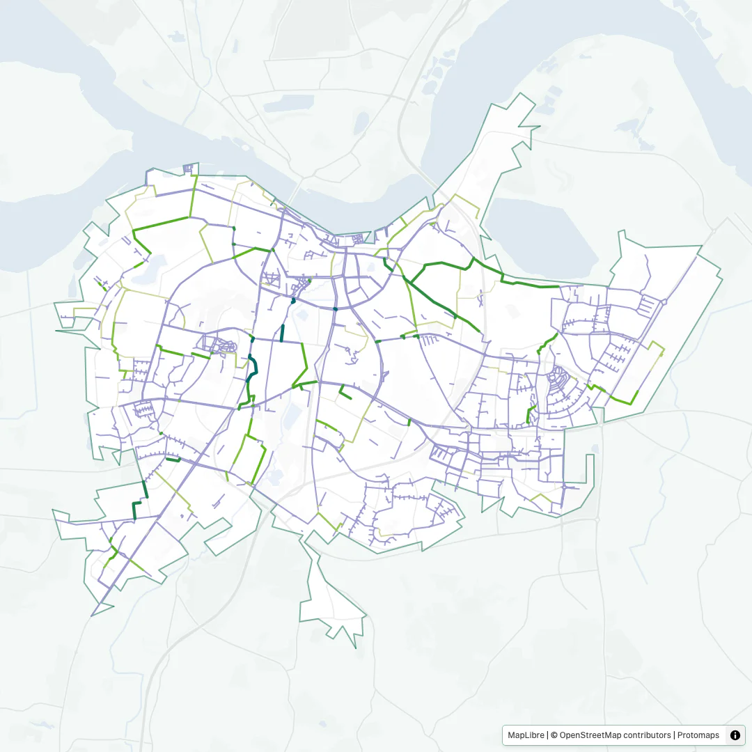
Circular city thumbnail with hover scale. Props: href, image, alt, label, sublabel?, size?.
CodeSample
Terminal-styled, read-only shell/REPL sample for tool pages. Props: code, label?, maxHeight?, minHeight?, prompt?, requirements?, class?. Fluid width, content height; long lines scroll horizontally rather than wrap. Each line
carries a soft, pseudo-element prompt — > for a
shell line, switching to >>> once a line
enters a Python REPL and ... for its bracketed
continuation lines — so selecting the sample still copies the bare commands (prompt={false} turns it off entirely). The three window dots are the only non-palette color in the component
(--color-terminal-dot-*). Shown here in the row the
tool pages use — terminal (its title bar carries the requirements line, right-aligned next to the dots), then
the Docs and Code links.
Requires Python>=3.12
				conda install fixbikenet

				python

				import fixbikenet as fbn

				fbn.fixbikenet('Frederiksberg Municipality')
Empty state: a tool whose commands are not published yet (code="") renders chrome only, held open by minHeight. No
prompt, no lines, and the body is aria-hidden — there
is nothing to scroll or announce. A tool with only one of the two links keeps the same button
width and leaves the second cell empty, so the links are the same size on every tool page.
Heavy components
Not instantiated here because they require live data, WebGL, or full-bleed layout. The map itself is shown live under Maps.
- HeroSection
- Landing-page hero: brand logo, headline, and an ambient map background with radial gradient overlay.
- AmbientHeroMap
- 3D orbiting MapLibre camera that cycles through city/tool combos with build → orbit → tear transitions.
- AmbientHud
- Monospace HUD overlay (LAT/LON/BRG/ZOOM, frame counter, blinking cursor) layered over AmbientHeroMap. Uses IBM Plex Mono.
- ToolShowcase
- Responsive grid of six ToolCards: the active and coming-soon interactive tools, plus a "More tools" tile linking to /more-tools.
- InfoGrid
- Multi-column info block on the landing page (stats, news, team, sponsors, embedded CitySearch).
Routing overview
SvelteKit file-based routing under www/src/routes/.
src/routes/
├── +layout.svelte            root layout (favicon + layout.css + Meta)
├── +page.svelte              landing page (no sidebar)
├── layout.css                global styles + @theme tokens
├── design/                   ← this page (hidden, noindex)
├── legal/                    imprint & privacy
├── sitemap.xml/+server.ts    generated sitemap
├── embed/[tool]/[city]/…     chrome-free iframe embed
├── og/[name]/                Open Graph card source (pnpm generate:og)
├── og/map|city/…             per-city Open Graph cards (pnpm generate:og-cards)
├── screenshot/[tool]/[city]/ Playwright screenshot routes
├── animation/[tool]/[city]/  chrome-free build-up route (gif / video)
└── (app)/                    layout group with sidebar nav
    ├── +layout.svelte        sidebar
    ├── cities/               index, [city], table/
    ├── more-tools/           BikeNetLib + related tools, one page, anchored sections
    ├── (tools)/(interactive)/    tool landing pages, no city selected
    │   └── growbikenet/ linkbikenet/ fixbikenet/ sortbikenet/ superblockify/
    └── (map)/                +layout@.svelte — full-bleed, escapes the sidebar shell
        ├── growbikenet/[city]/[metric]/[type]/[variant]/
        ├── linkbikenet/[city]/[metric]/[type]/
        ├── fixbikenet/[city]/[metric]/[type]/
        ├── sortbikenet/[city]/[metric]/[type]/   metric = ordering, type = scenario
        └── superblockify/[city]/[metric]/[type]/
Spec — DESIGN.md
The written companion to this page, rendered from the copy committed in this build. Where the two disagree, this page wins.
www/DESIGN.md DESIGN.md — BikeNetKit
AI AGENT INSTRUCTIONS — READ FIRST, APPLY TO ALL OUTPUT
This file is the visual specification for the BikeNetKit website and its embedded tool visualisations. Apply every rule below to every line of UI, HTML, CSS, or Svelte component code you generate.
- Source of truth — The tokens in the
@themeblock ofwww/src/routes/layout.cssand the components inwww/src/lib/components/are authoritative. This file and the hidden/designroute document them. If either disagrees with the code, the code wins, and the documentation is what gets fixed.- Colours — Use only the tokens, via
var(--color-…)or the matching Tailwind utilities (bg-brand,text-ink, etc.). No raw hex in templates. Raw hex for MapLibre paint lives inwww/src/lib/colors.js(overlays) andwww/src/lib/map-style/theme.js(the basemap palette).- Typography — Use the three families declared in
@theme:font-display(Bespoke Sans),font-sans(Public Sans),font-mono(IBM Plex Mono). Match weights and sizes to the conventions below. Bespoke Sans is not in the repository; see www/README.md § Fonts for how to install it.- Unknowns — If a visual decision is not defined here, check
layout.css. If it is still undefined, ask before inventing.
Stack
- SvelteKit + Svelte 5 (runes:
$props,$state,$derived). - Tailwind CSS v4 with the
@themedirective inlayout.css. There is notailwind.config.js. - Plugins:
@tailwindcss/forms,@tailwindcss/typography. - MapLibre GL for maps; bits-ui for primitive components.
- Package manager: pnpm.
Design System Summary
- Source: the
@themeblock inwww/src/routes/layout.css. - Colour tokens: base primitives plus the brand, ink, surface, border, ramp, existing-network, category, terminal and notice families, several of them aliases of a primitive.
- Font families: display, sans and mono.
- Map layers: a self-hosted Protomaps basemap under the GeoJSON overlay stack, specified in § Maps.
- UI components: the reusable ones are documented below. The other
.sveltefiles inwww/src/lib/components/are internals of those.
Colour tokens
Use only these values. Reference them as
var(--color-<name>)in CSS, or as Tailwind utilities likebg-brand,text-ink,border-border-weaker.
Base palette (primitives)
| Token | Value | Notes |
|---|---|---|
--color-base-eden |
#096a51 |
primary brand green |
--color-base-turtle-green |
#426736 |
brand ink |
--color-base-teal |
#7cac96 |
|
--color-base-teal-light |
#accabc |
|
--color-base-teal-lighter |
#d4e4db |
|
--color-base-teal-lightest |
#eef5f1 |
|
--color-base-lime |
#3cd71d |
vivid accent |
--color-base-sand |
#f7f7f0 |
paper base |
Brand (semantic)
| Token | Value | Alias source |
|---|---|---|
--color-brand |
#096a51 |
← base-eden |
--color-brand-ink |
#426736 |
← base-turtle-green |
--color-brand-vivid |
#3cd71d |
← base-lime |
--color-brand-vivid-light |
color-mix(in lch, lime, #ffffff 30%) |
computed lighter lime → #89e56f |
--color-brand-vivid-dark |
color-mix(in lch, lime, #000000 10%) |
computed darker lime → #39bf1e |
--color-brand-darkest |
color-mix(in oklab, brand, #000000 50%) |
video-lightbox scrim → #01241a; oklab, not lch, so the darkening stays neutral |
--color-brand-muted |
#7cac96 |
← base-teal |
--color-brand-light |
#accabc |
← base-teal-light |
--color-brand-subtle |
#d4e4db |
← base-teal-lighter |
--color-brand-secondary |
color-mix(in lch, brand, muted 30%) |
computed mid-green → #367d65 |
lime, brand and muted above are shorthand for the var(--color-…) references in layout.css.
The resolved hexes are what the /design swatches and the token exports emit, read in the browser
rather than computed by hand.
Ink (text)
| Token | Value | Notes |
|---|---|---|
--color-ink |
#426736 |
default body text (← brand-ink) |
--color-ink-weaker |
#607858cc |
secondary text (80% alpha) |
--color-ink-weakest |
#60785899 |
tertiary text (60% alpha) |
--color-ink-alt |
#096a51 |
alt ink (← brand) |
--color-ink-alt-weaker |
#5b8b75 |
|
--color-ink-alt-weakest |
#7cac96cc |
(80% alpha) |
--color-ink-link |
#107a50 |
inline prose links — apply via .link |
--color-ink-link is color-mix(in oklab, brand, brand-vivid 15%): more chromatic and lighter than
brand, so a link separates from the brand-coloured headings and the ink body copy around it.
Contrast is AA on every surface it sits on: 5.4:1 on white, 5.0:1 on paper, 4.8:1 on
paper-brand. Do not push it further toward brand-vivid; past ~20% the mix drops below 4.5:1 on
paper-brand. (Lightning CSS bakes a #117a49 fallback for engines without color-mix, with the
same contrast to within 0.03.)
Surfaces (paper)
| Token | Value | Notes |
|---|---|---|
--color-paper |
#f7f7f0 |
default page background |
--color-paper-base |
#f7f7f0 |
(← base-sand) |
--color-paper-brand |
#eef5f1 |
brand-tinted surface |
--color-paper-white |
#ffffff |
card / input surface |
Borders
| Token | Value | Alias |
|---|---|---|
--color-border |
#7cac96cc |
← ink-alt-weakest |
--color-border-weaker |
#7cac96cc |
← ink-alt-weakest |
--color-border-weakest |
color-mix(in lch, ink-alt-weakest, #ffffff 50%) |
hairline rules (tooltip rows) |
Visualisation ramp
Used by MapLibre paint expressions for choropleth-style metric encoding. The JS copy for MapLibre
lives in src/lib/colors.js.
| Token | Value |
|---|---|
--color-ramp-0 |
#e7e1d1 |
--color-ramp-1 |
#d3d59c |
--color-ramp-2 |
#65b81d |
--color-ramp-3 |
#00676f |
Ramp direction is always "ramp-3 = the segment that matters most": every dataset carries a metric column, and the ramp runs low-to-high across it without exception. Which stops a tool uses differs per tool (§ Metric ramp).
LinkBikeNet's connectivity gain is the one variant. Many of its links add nothing to the
largest component when they are built, because they join two small pieces; in a
closest_components build that is most of them. The ramp spreads only over the links with a gain
above zero, and the rest take its first colour. That colour is ramp-1 mixed 40% towards ramp-2
(#a7c969), followed by ramp-2 and ramp-3, because ramp-0 all but vanishes as a thin line on
the paper basemap. rampColorsFor() in line-paint.js and the floor in metric-scale.js define
it, and every renderer goes through them: map, legend, landing hero and SVG export.
Existing network
Periwinkle baseline for already-built bike infrastructure, deliberately off the green ramp so that
the ramp stays exclusive to newly proposed links. LinkBikeNet encodes connectedness as saturation,
not hue. The JS copy for MapLibre paint lives in src/lib/colors.js.
| Token | Value | Notes |
|---|---|---|
--color-existing-network |
#9999cc |
existing bike infrastructure baseline |
--color-existing-network-connected |
#4c4c99 |
wired into the largest connected component |
--color-existing-network-hover |
#7a7aa3 |
map hover state |
--color-existing-network-ink |
#6a6ab8 |
baseline lengths as text (no JS mirror) |
Categorical
Qualitative palette for SuperBlockify's superblock fills. The assignment is hashed, so these carry
no order. See src/lib/utils/superblocks.ts.
| Token | Value | Notes |
|---|---|---|
--color-category-0 |
#6ab8df |
|
--color-category-1 |
#f19730 |
|
--color-category-2 |
#77be3a |
|
--color-category-3 |
#2ed6a6 |
|
--color-category-4 |
#8579d7 |
|
--color-category-other |
#c2c2b3 |
unclassified fallback |
Terminal chrome
The three macOS window dots on CodeSample. Deliberately not brand tokens: they are the cue
that says "this is a shell command", and recolouring them green would erase it. They are purely
decorative (aria-hidden) and never the sole carrier of meaning. Everything else in the component
uses paper-brand / paper-white / ink / border-weaker. Do not reuse them elsewhere.
| Token | Value |
|---|---|
--color-terminal-dot-red |
#ff5f56 |
--color-terminal-dot-amber |
#ffbd2e |
--color-terminal-dot-green |
#27c93f |
Notice
Pale amber for a state the reader must not miss: UnavailableNotice, and the matching hover
preview on a tool tab the city has no data for. Amber so it stands apart from an all-green UI.
Body copy on it stays in the ink colours (ink-alt at 6.0:1), and notice is for the heading and
the CircleAlert icon (5.4:1). Reach for it through CardPanel surface="notice" where possible.
| Token | Value | Use |
|---|---|---|
--color-base-amber |
#e6b450 |
primitive |
--color-base-amber-lightest |
#fdf4dc |
primitive |
--color-notice |
#8a5a00 |
heading + icon on the fill |
--color-notice-border |
var(--color-base-amber) |
border, callout caret |
--color-notice-subtle |
var(--color-base-amber-lightest) |
fill |
Typography
Three families, declared in @theme:
--font-sans: 'Public Sans', sans-serif;
--font-display: 'Bespoke Sans', sans-serif;
--font-mono: 'IBM Plex Mono', ui-monospace, monospace;
The other non-colour tokens in @theme:
--text-2xs: 0.625rem; /* 10px — telemetry, counters → `text-2xs` */
--tracking-tight: -0.015em; /* → `tracking-tight` */
--tracking-tighter: -0.02em; /* → `tracking-tighter` */
--spacing-name-word-gap: 0.1319em; /* gap between the words of a tool name (§ The word gap in rendered names) */
--container-page: 1920px; /* widest the page content column gets → `max-w-page` */
Beyond --container-page the content centres and the page background fills the rest.
Conventions in use
| Usage | Family | Tailwind classes |
|---|---|---|
| Brand logotype | Bespoke Sans | font-display text-4xl font-bold italic |
| Display heading | Bespoke Sans | font-display text-2xl font-semibold |
| Section heading | Bespoke Sans | font-display text-lg font-bold |
| CTA / accent label | Bespoke Sans | font-display text-sm font-bold italic |
| Body | Public Sans | default size / text-sm |
| Caption / coming-soon | Public Sans | text-xs text-ink-weakest |
| Legend / tooltip title | Public Sans | text-2xs font-semibold tracking-wider text-ink-alt-weaker uppercase |
| Legend / tooltip value | Public Sans | text-xs / text-lg / text-2xl + tabular-nums font-semibold |
| HUD telemetry & counters | IBM Plex Mono | font-mono text-2xs tabular-nums |
Line wrapping is handled globally; don't set it per component. layout.css balances every
heading, and balances a <p> only when it has no adjacent paragraph sibling (a lone lede or card
blurb). Paragraphs that sit in a stack get text-wrap: pretty instead, because balancing each
block separately gives them visibly different measures. Override per element with text-balance /
text-pretty when a specific block needs the other behaviour.
Bespoke Sans is a variable font; usable weights are 300–800. Conventionally used: 400, 500, 600, 700, 800. Italic is supported. It is not committed to the repository; see www/README.md § Fonts.
IBM Plex Mono is a static font family, self-hosted from static/fonts/IBM_Plex_Mono/ in the
upright weights 400 / 500 / 600 / 700 (no italic is bundled, so do not italicise font-mono
text). It has exactly two homes: HUD (heads-up display) telemetry overlays and small counters
(e.g. the PlaybackControl frame counter, the AmbientHud), and literal code: shell samples
in CodeSample, inline identifiers on /design. For legend titles, legend values, tooltip labels
and dates use font-sans (the default), with tabular-nums when alignment matters.
The word gap in rendered names
Wherever the site displays a tool name as text, it sets the same gap between the words as the
logo lockup (§ Logo sublogos), so a page heading is set the way the lockup is. Use ToolName;
never hand-roll it:
<ToolName name={tool.name} parts={tool.nameParts} />
It emits one <span class="name-word"> per word with no whitespace between them, and
.name-word + .name-word in layout.css applies --spacing-name-word-gap (0.1319em, the
lockup's wordGap as an em fraction). So textContent stays GrowBikeNet verbatim, and the name
keeps its single break opportunity: none.
Those word spans sit inside one wrapping <span>, which is load-bearing. Several call sites
drop the name straight into a flex container with a gap (the map tool tabs, the compact tool
switcher, the coverage table headers). Without the wrapper each word becomes a flex item of its
own and picks up that container's gap on top of .name-word's margin, setting the name several
times wider than the lockup. The wrapper keeps it a single inline box whatever the parent's
display is.
A thin-space character would fail both ways. Bespoke Sans ships no glyph for U+2009, U+200A,
U+202F or U+2006, only U+00A0, so the gap width would come from whatever fallback face the OS
picked; and those characters are break opportunities, which would let a name wrap mid-word in a
narrow column such as the /cities/table headers.
Two places it must not go:
- Attributes and head metadata:
title=,aria-label=,alt=,<title>,og:*, JSON-LD. Those taketool.nameunchanged. Attributes cannot hold markup, and an invisible gap in an accessible name or a search result is a regression, not a refinement. - Phrases that merely look like names: the landing page's "More tools" tile, the
AmbientHud's monoTOOL :line (that is the slug, styled as telemetry). The gap is tighter than a word space, so setting a phrase with it reads as a typo.
nameParts on a tool is an override for a name the camel-case splitter gets wrong. No tool needs
it yet; pass it through anyway so a future one can.
Brand assets & exports
The /design page generates the brand assets below in the browser from the source SVGs in
www/src/lib/assets/brand/. None of the derived files is stored in the repo except the Open Graph
cards.
Logo sublogos
The /design page generates per-tool lockups by re-setting the wordmark text of
logo-word-mark-horizontal.svg. The original wordmark is outlined Bespoke Sans Bold Italic;
these values were recovered by fitting the font against its glyph outlines and reproduce it
exactly:
| Property | Value |
|---|---|
| Font | Bespoke Sans Bold Italic (BespokeSans-BoldItalic.woff) |
| Size | 32 SVG user units |
| Fill | #096A51 |
| Baseline | y = 43.64 |
| Text ink left edge | x = 76.28 (icon ink ends at x = 64, so a 12.28 gap) |
| Trailing margin | 6.792 — canvas width = ink right + trailing |
| Canvas height | 59 |
| Word gap | 4.22 ( = 0.1319em ), inserted at each camel-case boundary |
Kerning applies inside each word only; the word gap replaces it between words, matching how
Bike Net Kit is set. Camel-case names are split on word boundaries with acronym
runs kept intact (BikeDNA → Bike DNA); all-lowercase names such as superblockify stay whole.
Generated text is converted to <path> outlines rather than <text>, so downloads carry no font
dependency and rasterise through the same svgToPng() helper as the other brand assets. The logic
lives in www/src/lib/design/sublogo.js; the camel-case splitting itself is shared with the HTML
rendering (§ The word gap in rendered names), in www/src/lib/utils/word-mark.js.
Banners
The generated lockup, centred on the city-bg artwork. One banner is rendered on two canvases:
| Canvas | Size | Used for |
|---|---|---|
CANVAS.github |
1280 × 640 |
GitHub repo social previews — downloaded from /design |
CANVAS.og |
1200 × 630 |
the site's Open Graph cards in www/static/og/ |
The Tool logos section on /design has a second tab for the GitHub variant: one per tool, plus
BikeNetKit itself and whatever is typed into the custom field. Downloads are PNG 1× (exactly
1280 × 640), PNG 2×, and SVG.
Geometry is expressed as ratios of the canvas in www/src/lib/design/banner.js, so both sizes
share one layout:
| Property | Derivation | github | og |
|---|---|---|---|
| Content box | width × 0.8125 |
1040 |
975 |
| Lockup scale cap | height × 0.295 / 59 |
3.2 |
3.15 |
| Background scale | cover(canvas) × 1.02 |
0.68 |
0.6375 |
| Background shift | (canvas − artwork × s) / 2 |
−12.8 / −47.2 |
−12 / −29.25 |
| Crop-safe border | 40 — GitHub's recommendation; nothing is drawn inside it |
||
| Halo | 5 px of #f7f7f0 (paper) around the mark and the wordmark |
The halo is an underlay of the same shapes, filled and stroked in the paper colour, so streets
in the artwork stop cleanly at the lockup. A centred stroke grows only half its width outward and
the underlay sits inside the scaled lockup group, so the stroke width is 5 × 2 / scale.
The background is a cover-crop: the artwork is 16∶9 and neither canvas is, so it is scaled with 2 %
overscan, which pushes its rx=10 corners and its 1 px border stroke outside the viewport (the root
<svg> clips them). bannerLayout() returns geometry only. BannerArt.svelte renders it on screen
with the rasterised city-bg@2x.png as an <image> (cheap, cached once for all cards), while
bannerSvg() nests the vector artwork for a self-contained download. Both read the same geometry,
so they cannot drift.
Open Graph cards
www/static/og/<name>.png: bikenetkit.png plus one per tool slug, 1200 × 630, committed to
git. Regenerate them with pnpm generate:og after any change to the artwork, the halo, the
lockup metrics or a tool name. The job screenshots the hidden /og/[name] route (which renders the
same BannerArt as the /design previews) against a preview build and quantises the result
through sharp.
The per-city cards are a separate pipeline: pnpm generate:og-cards photographs the
/og/map/[tool]/[city] and /og/city/[city] routes (OgCityCard.svelte: the lockup, the city
name and the result's screenshot in a circle) into www/screenshots/og/, served from the data
host. A page uses its card only once the committed og-cards.json lists it.
src/lib/components/Meta.svelte puts the cards on the pages. It is mounted once, in the root
+layout.svelte, and reads page.data.meta; a second instance anywhere would emit a second
og:image and leave crawlers to pick one. Pages contribute { title, description, image, imageAlt, noindex } from their load; toolMeta() in src/lib/data/meta.js builds it for the tool routes.
Site-level values (canonical URL, tagline, default card) live in src/lib/site.js.
Derived brand assets
logo-white-padded (25 % padding) and logo-white-padded-narrow (12.5 %) are generated in
www/src/lib/design/assets.js rather than stored as files: a 512 × 512 white canvas with
logo-colors.svg fitted into the inset box and centred. Deriving them means the mark can never
drift from its source; add a further variant by extending PADDED_VARIANTS.
The two QR codes, qr-code.svg and qr-code-logo.svg (740 × 740, both encoding
https://bikenetkit.org, with the mark sitting inside the code's error-correction budget), ship
transparent. Their sand (#f7f7f0) and white variants are derived the same way, in
BACKGROUND_VARIANTS: a full-size <rect> is inserted behind the code. The logo version carries a
sand plate behind the mark, so the white variant also recolours that plate to white; the
transparent and sand variants keep it. Verify a regenerated code with zbarimg before committing.
Token exports
/design offers the tokens in two JSON shapes, both built in www/src/lib/design/tokens.js from
the same in-browser probe, so color-mix() and var() chains come out as concrete hex, and the
80 %-alpha inks as 8-digit hex. Neither is stored as a file.
| Format | File | Builder | For |
|---|---|---|---|
| W3C | bikenetkit.tokens.json |
buildDtcgExport() |
Design Tokens Community Group interchange — Style Dictionary, Tokens Studio, Figma |
| Flat | bikenetkit-design-tokens.json |
buildTokenExport() |
the older BikeNetKit shape; the only one carrying --var names and raw CSS |
The W3C file groups tokens under color / fontFamily / fontSize / letterSpacing, hoists
$type to the group, and takes $description from the TOKEN_NOTES map. Two deliberate calls:
- Aliases are recorded, not referenced.
--color-brand: var(--color-base-eden)could be"$value": "{color.base-eden}", which is the more idiomatic DTCG. It ships the resolved hex instead, with the--color-…name and original declaration in$extensions["org.bikenetkit"], so every consumer reads a literal and none has to resolve an alias graph. letterSpacingdeviates. DTCG'sdimensiontype admits onlypxandrem; the tracking tokens are inem, which is relative to the element's own font size and cannot be converted. They ship asdimensionwith a$descriptionflagging it, rather than being dropped.
Spec preview
The #spec section of /design renders this file. renderMarkdown() in
www/src/lib/design/markdown.js (marked, pinned) strips the YAML front matter, prefixes every
heading id with spec- so they cannot collide with the page's own anchors, and returns a
##-level table of contents. Repo-relative links render as plain text, because nothing is served at
those paths on the site. It runs in design/+page.server.ts, i.e. once at prerender, so marked
never reaches the client bundle. .prose-brand in layout.css retints @tailwindcss/typography;
it is unlayered on purpose, because the plugin emits .prose into the utilities layer and a
rule of equal specificity inside @layer base would lose to it.
Button & control patterns
Reusable primitives live in www/src/lib/components/ui/ (§ UI primitives lists them with their
props). Compose these; do not re-inline the equivalent Tailwind class strings.
ExternalLinkButton's two variants are a placement rule, not a preference. solid (brand
green, white icon and label) carries the "Docs" and "Code" links in a row under the commands in a
tool page's "Run it yourself" section: there they are the call to action a reader reaches for
after the commands. outline carries a static tool's "Paper" and "Code" inside
ToolReferenceCard, beside the description on /more-tools: a filled button there would shout
over the citation that is the point of the card. An interactive tool's paper needs no button at
all, since its whole PaperStack sheet is the link (below). So the same "Code" link is solid on an
interactive tool's page and outlined on a static tool's. The context differs, which is why
isStatic renders them from two different components.
The tutorial is a thumbnail, not a button. tool/ToolTutorialTeaser.svelte sits beside the
description on an interactive tool's page. It borrows the landing page's video teaser (a
rounded-2xl 16:9 still with a centred brand-green play disc) and the city map teasers' hover
(CityTeaser: a brand-muted hairline that turns brand with a shadow, then scales up with a
2 px ink border under the pointer), with a caption below. It links out to YouTube in a new tab
rather than opening a lightbox, since the tutorials are not self-hosted. The still is committed
under src/lib/assets/media/tutorials/ by pnpm generate:tutorial-thumbs, which also crops off
YouTube's blurred pillarbox edges; without one the teaser falls back to a solid play button.
The citation is a stack of paper beside the terminal. On an interactive tool's page, "Learn
more about the science" is tool/PaperStack.svelte: a sheet (at least square, taller if the
citation needs it; capped at max-w-xs on narrow screens) in the terminal's chrome (rounded-sm,
border-weaker, paper-white, px-6 py-5), with two copies of the same size peeking out behind
it, each shifted 6 px further down and to the right. The whole front sheet links to the paper,
marked by an up-right arrow in its bottom corner rather than a "Paper" button; on hover its border
turns brand with a shadow and the arrow nudges outward. A static tool's ToolReferenceCard on
/more-tools stays plain. The "Data built with v…" line sits left-aligned in the right-hand column
of the title row, its last line on the tool name's baseline (items-baseline-last): it describes
the data on the page, not the paper.
"Take action!" is the one underlined button on the site. It is the call to action that sends
a reader off the site and into local advocacy (the city's cycling and contact pages, the transport
ministry, a cycling organisation), so it stands apart from the toolbar's other controls, but
quietly: the same white fill and border-weaker outline as the tool tabs, a brand-coloured label
and megaphone, and a thick half-strength lime underline on the label
(decoration-brand-vivid/50 decoration-4). On hover, and while its popover is open, it inverts to
white on brand, like the active tool tab. Keep it that quiet: lime fills, outlines, hard shadows
and glows all make it the loudest thing on the page. Below lg it collapses to the icon (with an
aria-label naming the city). The link list itself is TakeActionLinks
(components/TakeActionLinks.svelte), shared by the toolbar popover and the plain "Take action in
…" section at the foot of /cities/[city], beside "More tools" and styled like it, except that its
heading carries the same megaphone and lime underline. Every link opens in a new tab and says so,
and which language it is in, to screen readers.
Links inside body copy always use .link, never bare text-brand. Colour alone does not
distinguish a link from the brand-coloured text around it (WCAG 1.4.1), so .link carries a
resting underline; it darkens and thickens on hover and has a focus-visible ring. .link-quiet
suppresses the resting underline for grids or lists where every item is a link (the team tiles);
do not use it in a sentence.
Proper names use .display-name (font-display font-bold italic) rather than spelling those
three utilities out. It carries tool names in headings, cards and the breadcrumb, and the "Cities"
heading: anything that reads as the name of a thing rather than a label.
Three patterns remain inline because they are tightly coupled to their context:
| Pattern | Classes |
|---|---|
| Inline prose link | link — defined in layout.css. Add link-quiet for link grids/lists where the underline only shows on hover |
| CTA link | inline-flex items-center gap-1 font-display text-sm font-bold italic text-brand hover:underline (with trailing chevron <svg>) |
| Sidebar nav item | rounded-md px-3 py-2 text-sm font-semibold + active bg-brand text-white / inactive text-ink hover:bg-brand-subtle hover:text-brand |
SegmentedControl
Two modes:
<!-- Button-driven (local state) -->
<SegmentedControl {options} {active} onSelect={(v) => (active = v)} />

<!-- Link-driven (route state) -->
<SegmentedControl {options} {active} hrefFor={(v) => `/path/${v}`} capitalize />
options: { value, label }[]. Pass capitalize for type-like labels. Always pass ariaLabel:
the control is a labelled role="group" in both modes. In link mode the active option carries
aria-current="page" and keeps focus across the navigation (data-sveltekit-keepfocus).
Accessibility
The target is WCAG 2.1 AA, best-effort; /legal §5 publishes the statement and its known
limitations, so keep the two in step. pnpm check:a11y (axe on every route family, aria snapshots,
keyboard walks) guards what follows.
- Focus ring. A base-layer rule in
layout.cssgives anything focusable a 2pxbrandoutline at 2px offset. Utilities win over it, so a component may restyle focus but must not remove it: never addfocus:outline-nonewithout a visiblefocus-visible:replacement. On a dark surface (bg-brand,surface="dark") usefocus-visible:outline-paper-white. Rows inside a scrolling list usefocus-visible:-outline-offset-2so the ring is not clipped. Dialog containers and<main tabindex="-1">are the only places focus is styled away. - Every page has a
<main id="main" tabindex="-1">. The skip link in the root layout targets it. A new route outside the existing layouts must add one. - Label in name. A control's visible text must appear in its accessible name (WCAG 2.5.3).
Prefix with an sr-only span (
Change city:) rather than replacing the text witharia-label. Usearia-labelalone only for icon-only controls. - Don't drop focus. A button that dims at an end state (playback step, top-spots tour, reset
view) uses
aria-disabledand ignores the press, so focus stays on it.IconButton'sdisabledprop already works this way. A control that unmounts on its own press hands focus to the natural next element first. - Announce, don't narrate. State changes the reader caused or is waiting on go through
announce()($lib/state/announce.svelte.js), which speaks through the single polite region in the root layout. Don't addaria-liveto content that changes on hover or on every slider step. Throttle a count if it has to be spoken (timeThrottled). - Reduced motion. A global rule in
layout.csscollapses CSS animations and transitions. JS motion readsreducedMotion($lib/state/motion.svelte.js): the map build-ups jump to the last frame, and the hero shows one city and stops. Anything that moves for more than five seconds needs a pause control. The hero has none, by maintainer decision;/legallists that as a known limitation. - The map has a non-visual equivalent. The canvas cannot be read, so every map page offers
"View as table": a summary sentence, how the network builds up (sampled at every tenth of the new
length) and its most important parts, built by the pure functions in
$lib/data/map-tablefrom the layers the map is painting. It describes the finished result, not the playhead; the "Current values" region already speaks that. Screen-reader users reach it from the InfoPanel, whose entry stays off-screen until focused. A new tool needs a builder there, andpnpm check:map-tablesruns every builder over real data. - Decorative is hidden. Charts that repeat a number already on screen, chevrons, swatches and
the hero map are
aria-hidden(the hero layer alsoinert). A picture that carries meaning getsrole="img"and a sentence, like the legend's colour scale. sr-onlyneeds a positioned ancestor insidemainor a scroll container, or it escapes and scrolls the page. Putrelativeon the parent.- New tabs say so. A
target="_blank"link ends with<span class="sr-only"> (opens in new tab)</span>, or appends it to itsaria-label. - Contrast.
ink-alt-weaker,ink-weaker,ink-weakest,brand-mutedandbrand-vivid-darkfall below 4.5:1 as body text. Don't use them for text that carries information until the tokens are retuned; axe reports their contrast on every route without failing the run.
Maps
The map is the product, so it has a spec of its own. The basemap is quiet, self-hosted context, and
the GeoJSON overlays are the subject. Every value below names the constant it comes from: change
the constant, never a copy of it. The #maps section of /design draws each layer from those same
constants, beside a live basemap and a live embed per tool.
Layer stack
Top to bottom:
…-hulls-outline                  SuperBlockify hover — the one overlay above the labels
basemap labels                   address_label … places_country (every symbol layer)
──── overlayBeforeId() = address_label ────
…-seeds-dots                     GrowBikeNet seed points
…-metric-dots, …-rank-labels     FixBikeNet overview dots, below DOT_LINE_CROSSFADE
…-selection-outline, -selection  FixBikeNet pinned gap
…-highlight-outline, -highlight  hover (BuildupLayers: flat ink, no outline)
…-hulls-boundary                 SuperBlockify, density mode only
…-metric, …-edges                the result
…-hulls                          SuperBlockify block fills
…-existing                       the existing bike network
…-plan                           SortBikeNet plan underlay
…-context-dots, -symbols         GrowBikeNet rail stations and schools
city-boundary-line               MapHost
city-boundary-mask-fill          MapHost
basemap street network           tunnels, buildings, roads, rail, boundaries, bridges
basemap ground                   background, earth, landuse, water
- Every overlay goes in with
beforeId={overlayBeforeId()}, so place names stay legible on top of the network. MapLibre inserts each layer directly beneath that anchor, so within a component the declaration order is the drawing order: declare a new layer where it belongs in this list. - The anchor must always exist. Hiding labels sets
visibility: 'none'rather than removing the layers, which is what keepsaddress_labelsafe as abeforeId(see § Basemap labels). - The city boundary mounts with the style, before any tool's layer set, so the tool draws over
it. The SuperBlockify hover outline is the deliberate exception at the top: it has no
beforeId, so it outranks the labels.
Basemap (Protomaps)
| Part | What |
|---|---|
| Tiles | One self-hosted PMTiles archive (PUBLIC_BASEMAP_URL), read with range requests through the pmtiles:// protocol. Z0–15, overzoomed to MAX_ZOOM 17. See DEPLOY_TILES.md. |
| Layers | map-style/layers.js, a fork of Protomaps' layers() for the WHITE flavor — not the @protomaps/basemaps package. makeMapStyle() in style.js adapts it per city. |
| Glyphs | Self-hosted at /fonts/maplibre/{fontstack}/{range}.pbf: Public Sans Regular, Bold and Italic (fonts in theme.js). |
| Sprite | None. The rail and school icons are rasterised at runtime (context-icons.js). |
| Attribution | "© OpenStreetMap contributors | Protomaps". It rests as its ⓘ button wherever the map has chrome (§ Map page shell). |
| Export | static/bikenetkit-map-style.json is a self-contained copy of the style for use outside the site (DOCS_MAP_INTEGRATION.md). |
No tile, glyph or sprite request leaves our own origins. That is the project's standing constraint,
and pnpm check:build-output guards it.
Palette
Greys throughout, so nothing in the basemap can be read as data. theme.js spreads the Protomaps
WHITE palette (BASE_PALETTE) and overrides three keys:
| Key | Protomaps WHITE | BikeNetKit | Effect |
|---|---|---|---|
background |
#ffffff |
#f7f7f0 (paperBase) |
the area outside the tiles matches --color-paper |
water |
#dcdcdc |
#e9f0f9 |
the one tint in the basemap, map-specific and not in Figma |
city_label |
#5c5c5c |
#000000 |
city names in black |
earth is restated as #FFF, which is the base value. Every overlay is specified against that
white ground. Never bring brand green or a ramp colour into the basemap: the overlays own colour.
Basemap labels
The basemap is deliberately quiet: the network is the subject, and place names are orientation
only. Three rules keep it that way, all in $lib/map-style/. Every threshold below lives in
render-config.js; change them there, never inline in layers.js.
1. Labels are staggered by importance and zoom. places_subplace reveals in three tiers via
SUBPLACE_ZOOM. Protomaps ships quarter features into tiles one to two zoom levels before they
should be drawn and expects the style to gate them; without the gate a city view at z≈12 carries
dozens of them.
| layer / tier | matches | example | from zoom |
|---|---|---|---|
places_subplace — city district |
population_rank >= 8 |
Centrum, Zuid, 11e Arr. | 12 |
places_subplace — quarter |
kind = macrohood |
Jordaan, De Pijp | 13 |
places_subplace — small neighbourhood |
everything else | Kattenburg, Wittenburg | 14 |
roads_labels_major (ROAD_LABEL_MIN_ZOOM) |
major road names | Ringweg-West | 12 |
roads_shields (ROAD_SHIELD_MIN_ZOOM) |
motorway badges | A10, S116, N246 | 14 |
roads_labels_minor |
minor road names | side streets | 15 |
places_locality is gated on the tile's own min_zoom instead: that layer's contents range from
boroughs to single wharves, and Protomaps already ranks them.
2. Labels stop at the city boundary. label-clip.js drops places_subplace, places_locality
and roads_shields outside the city under study, via a within filter against
www/data/cities/<slug>-boundary.geojson (generated by
scripts/update-data.mjs --boundaries-only). Every map component takes a cityBoundary prop and
bakes it into the style with makeMapStyle() at construction, not in an effect, or /screenshot
can capture before it applies.
Road names are deliberately not clipped: they read as continuous geography, so one vanishing mid-street looks like a bug, where a dropped badge reads as intent.
Adding a layer to CLIPPED_LABEL_LAYERS requires its filter in layers.js to be expression
syntax: MapLibre reads ['all', <legacy filter>, …] as legacy throughout and rejects within.
3. Labels can be switched off, by the reader and for static exports. Every interactive tool
page carries a "Map labels" Show/Hide toggle in its settings menu, on by default; /screenshot passes showLabels={false}
outright, because those images are read at thumbnail size where basemap text is illegible noise over
the network. Either way makeMapStyle() sets visibility: 'none' on every symbol layer rather than
removing it, so the layer stack keeps its shape: setLabelVisibility() can flip it back on a live
map, and address_label is always present for overlayBeforeId() to anchor data overlays beneath.
A consequence worth knowing: the screenshots do not depend on any threshold in the table above, so
retuning them does not require recapturing.
The reader's choice lives in the query string (?labels=0), alongside GrowBikeNet's ?seeds=0
(seed points are on by default), so a view stays linkable. Both flags go through
$lib/utils/view-params.js, which reads them only in the browser: these routes are prerendered,
and SvelteKit throws on url.searchParams during prerender.
A city always keeps its own name, which comes from places_locality_capital and is never clipped.
Use node scripts/probe-labels.mjs <path> [zooms…] against a dev server to see exactly what each
layer renders per zoom before and after a change.
GeoJSON overlays
Three layer components draw every tool, all under components/map/: BuildupLayers
(GrowBikeNet, LinkBikeNet, SortBikeNet: the build-up tools), StaticLayers (FixBikeNet) and
SuperblockLayers (SuperBlockify). MapHost draws the city boundary for all of them. The capture
routes (/screenshot, /embed, /animation) mount the same components, so a rule set here holds
for every surface.
Line widths and zoom
Every width is specified in px at zoom 12 and passes through withZoomScale(), which
interpolates linearly over ZOOM_SCALE_STOPS. Lines are drawn with round caps and joins
(ROUND_LINE_LAYOUT).
| Zoom | Multiplier |
|---|---|
| 10 | × 0.66 |
| 12 | × 1.0 |
| 17 | × 3.5 |
The metric line runs between a tool's width range (renderConfig in tools.json, read through
lineWidthRangeFor()):
| Tool | Width at z12 |
|---|---|
| GrowBikeNet | 0.5–3 px (DEFAULT_LINE_WIDTH_RANGE) |
| LinkBikeNet | 1–4 px |
| FixBikeNet | 2–4 px |
| SortBikeNet | 2 px, constant |
SuperBlockify, edges |
0.5–2 px |
Three widths are not zoom-scaled, because they mark outlines rather than streets: the city boundary, the superblock density boundary and the superblock hover outline.
Metric ramp
computeRampStops() in line-paint.js places one colour stop and one width stop at evenly spaced
quantiles of the dataset's metric, and makeLinePaint() interpolates both. So the segment that
matters most is the darkest and the widest, the rule in § Visualisation ramp. The legend is drawn
from the same values by metricScale(), without waiting for the map.
| Tool | Colours |
|---|---|
| GrowBikeNet | RAMP_COLORS, ramp-0 → ramp-3 |
| LinkBikeNet | rampColorsFor('lcc_gain'): the gain ramp (§ Visualisation ramp) |
| FixBikeNet | FIXBIKENET_RAMP, ramp-1 → ramp-3 |
| SortBikeNet | SORTBIKENET_RAMP, reversed: ramp-3 → ramp-1, first-built darkest |
| SuperBlockify | categorical (§ Superblocks), or RAMP_COLORS in density mode |
Existing network
Drawn beneath the result wherever wantsExistingNetwork() asks for it (FixBikeNet, LinkBikeNet,
SortBikeNet, and GrowBikeNet's from_bikenw variant). Periwinkle, deliberately off the green ramp
(§ Existing network under Colour tokens), and thinner than any proposed link.
| State | Colour | Width | Opacity |
|---|---|---|---|
| Baseline | existingNetwork |
EXISTING_NETWORK_LINE_WIDTH 1.305 |
EXISTING_NETWORK_OPACITY 0.9 |
| Hovered | existingNetworkHover |
same | same |
| LinkBikeNet, fragmented | existingNetwork |
same | EXISTING_NETWORK_FRAGMENTED_OPACITY 0.55 |
| LinkBikeNet, connected | existingNetworkConnected |
same | 1 |
| SortBikeNet baseline | existingNetworkLight |
2 × the baseline (SORTBIKENET_EXISTING_STYLE) |
0.9 |
| SortBikeNet plan underlay | ink |
PLAN_UNDERLAY_LINE_WIDTH 0.87 |
PLAN_UNDERLAY_OPACITY 0.15 |
LinkBikeNet's connected state is a feature state set from lcc_step_<strategy> as the playhead
(the current step of the build-up) moves, so a segment turns saturated the moment the build-up
wires it into the largest connected component (LCC).
Hover & selection
A highlighted feature keeps its own ramp colour: pointing at a segment must never cost the
reader the value it encodes. Both states are drawn the same way: the feature redrawn thicker in its
metric colour, over a coreColors.ink casing (HIGHLIGHT_OUTLINE_INSET, ~2px a side) that
separates even the palest ramp values from the paper basemap. Highlight widths are derived from
each tool's own lineWidthRange (HIGHLIGHT_WIDTH_FACTOR), not fixed, so the highlight
out-thickens the network whatever scale it draws at.
A selection (the one segment a reader has actively picked, click-pinned or stepped to via a
top-spots tour) is the same treatment SELECTION_WIDTH_STEP wider, so it still outranks a hover
underneath it. FixBikeNet only, via StaticLayers's selectable prop; every other StaticLayers
tool has hover alone. The constants live in
src/lib/map-style/render-config.js. They are
MapLibre-paint-only, so there is no CSS mirror.
BuildupLayers (GrowBikeNet, LinkBikeNet, SortBikeNet) still hovers with a flat coreColors.ink
line. That is a known divergence, not a second intentional language; port it when the playback
reveal state is next touched.
Points
- Seeds (GrowBikeNet's starting points):
coreColors.inkdots with a white ring a third of the radius wide,SEED_CIRCLE_RADIUS2.5, zoom-scaled. The topmost overlay under the labels, so they read over any line. - Overview dots (FixBikeNet,
dotsWhenZoomedOut): belowDOT_LINE_CROSSFADE[0](z13) each gap is a dot at its middle vertex, crossfading to its line byDOT_LINE_CROSSFADE[1](z15). Ramp colour with a 1px white stroke;DOT_MARKER_RADIUS4.5, or withemphasizeTopthe ranked few atDOT_MARKER_RADIUS_TOP6 and the rest atDOT_MARKER_RADIUS_REST3.5. The ranked dots carry their rank in Public Sans Bold,DOT_RANK_TEXT_SIZE9, white with a 0.5px ink halo. A selected gap's dot grows toSELECTION_DOT_RADIUS6. The tool page turns this on;/embeddoes not. - Rail stations and schools: below.
Rail station and school symbols
GrowBikeNet's rail and school focus modes draw every station or school in the city as a solid
light-grey pictogram (Lucide train-front and house, filled, in the basemap's address-label grey
with a white halo). The symbols are the bottom-most of the tool's layers: the network and the solid
ink seed dots draw over them. The two marks answer different questions. The grey symbol says that a
place is there, and the dot says that the algorithm grew towards it. Keep them in those two
registers, and never draw the symbols in brand green or ink, which would make them read as data.
- They are rasterised at runtime in
$lib/map-style/context-icons.jsand registered on the map once per kind. There is no sprite, and emoji cannot pass through the glyph pipeline. - The icons appear from
CONTEXT_ICON_MIN_ZOOM: zoom 13 for stations and 14 for the far denser schools. Below that, each place is a small dot in the same grey (CONTEXT_DOT_RADIUS), so the set stays visible at the overview. Icons are not decluttered (icon-allow-overlap,icon-ignore-placement), so every place is drawn and none ever displaces a label. - They share the seed checkbox ("show rail stations", "show schools"): hiding the seeds hides the places too. The "Map labels" toggle does not hide them, because they are app data rather than basemap labels.
- The capture routes (
/embed,/screenshot,/animation) never fetch them, so the screenshot matrix does not depend on them. - Hovering or tapping a seed dot opens a "Seed point" tooltip (
seedPointCopyincontrol-copy.ts). It says what the seed is per focus: based on an actual station or school (or a grid point), adjusted to the existing street network. That is why the dots and the symbols do not line up exactly.
Superblocks
| Layer | Paint |
|---|---|
Block fill (…-hulls) |
category-0…4 by hashed classification (superblocks.ts), SUPERBLOCK_HULL_OPACITY 0.15; 0 for a block the size filter hides |
Streets (…-edges) |
the block's category colour, or the density ramp in density mode; a hidden block's streets fall back to category-other; SUPERBLOCK_EDGE_OPACITY 0.85; width over 0.5–2 px |
| Density outline | density-ramp colour, SUPERBLOCK_BOUNDARY_WIDTH 1.75; density mode only, where the fill no longer separates neighbouring blocks |
| Hover/pinned outline | coreColors.ink, SUPERBLOCK_HOVER_WIDTH 2, above the labels |
The categorical colours are read from the --color-category-* CSS tokens at runtime, so they have
no colors.js mirror.
City boundary
MapHost draws the city under study on every map: an inverted mask (invertBoundary() in
boundary-mask.js) filled brand at BOUNDARY_MASK_OPACITY 0.05 over everything outside the
city, and a brand outline, BOUNDARY_LINE_WIDTH 1 at BOUNDARY_LINE_OPACITY 0.5. Both sit under
every tool overlay. The same polygon clips the place labels (§ Basemap labels).
Adding or changing an overlay
- Hex values go in
$lib/colors.js(mirrored inlayout.cssif the UI shows them too), numbers inrender-config.js. Never a literal in a layer component's paint object. - Insert the layer beneath
overlayBeforeId(), at its place in § Layer stack, and update the stack here andOVERLAY_STACKin$lib/design/map-specs.js. - Mirror the change in the capture routes (
/screenshot,/embed,/animation) and runpnpm generate:screenshots, or the thumbnails stop matching the map. - If the SVG export should show it, extend
$lib/export/network-svg-props.js. - A ramp-driven layer takes its legend from
metricScale(), so the legend and the map cannot disagree. - Update this chapter, and check the specimen on
/design#maps.
UI Components
All components live in www/src/lib/components/. The hidden /design route renders the
lightweight ones live; the heavy ones are described here. Props marked ? are optional; the tables
list the key props, not every one.
Core
| Component | Path | Key props |
|---|---|---|
Map |
components/Map.svelte |
geojson, seeds?, showSeeds?, bounds?, cityBoundary?, showLabels?, metricProperty?, showControls?, showLegend?, showMetricLegend?, onToggleLabels?, frameOverride?, onidle? |
PlaybackControl |
components/PlaybackControl.svelte |
frame (bindable), total, isPlaying (bindable), onplay, onpause, onscrub, playbackMs; step buttons flank a fixed-width, two-line n over total counter |
CitySearch |
components/CitySearch.svelte |
cities, href? or onselect?, onNavigate?, placeholder?, geolocate?, class? |
CityTeaser |
components/CityTeaser.svelte |
href, image?, alt?, label?, sublabel?, size? ('sm' | 'md'), highlight?, star?, class? |
Map, MapStatic and MapSuperblocks are standalone wrappers: each owns a MapHost and mounts
one layer set (BuildupLayers, StaticLayers or SuperblockLayers). The capture routes
(/embed, /screenshot, /animation) render them. The map pages do not: they share the one
MapHost in the (map) layout and render the layer set on its own (§ Map page shell).
UI primitives
Co-located under components/ui/. § Button & control patterns gives the rules for using them.
| Component | Path | Use for | Key props |
|---|---|---|---|
IconButton |
ui/IconButton.svelte |
Circular icon button: solid brand-filled (play/pause) or ghost, small (step buttons) | ariaLabel, onclick?, onpointerdown?, variant? ('solid' | 'ghost'), size? ('md' | 'sm'), disabled?, ariaExpanded?, ariaControls?, children (icon snippet); other attributes are forwarded to the <button>, so it can be a bits-ui trigger via the child snippet |
ToggleButton |
ui/ToggleButton.svelte |
Bordered square icon-only button with a pressed state |
pressed, onclick?, title?, ariaLabel?, children |
CheckboxControl |
ui/CheckboxControl.svelte |
Labelled checkbox for optional map layers and modes (seed points, SuperBlockify's density colouring) | checked (bindable), label, title?, class? |
SegmentedControl |
ui/SegmentedControl.svelte |
Pill container of mutually exclusive options (variant/type/metric) | options, active, onSelect? or hrefFor?, capitalize?, ariaLabel? |
SelectMenu |
ui/SelectMenu.svelte |
Dropdown of the same options, for an axis too long for one row of pills (SortBikeNet's orderings) | options (each may carry a star tooltip), active, onSelect? or hrefFor?, ariaLabel?; the menu is portalled to body |
Badge |
ui/Badge.svelte |
Pill emphasis label (e.g. "Recommended!") | children |
RecommendedStar |
ui/RecommendedStar.svelte |
The star that marks a recommended city × tool pair | cityName?, label?, plain? |
CountryChip |
ui/CountryChip.svelte |
Two-letter country marker in city lists: a filter button with onclick, else inert |
code, country?, onclick?, class? |
ExternalLinkButton |
ui/ExternalLinkButton.svelte |
Link with icon | href, label, icon ('paper' | 'code' | 'docs' | 'play' | 'external'), variant? ('outline' | 'solid'), class? |
CardPanel |
ui/CardPanel.svelte |
Floating panel container | width?, gap?, surface? ('paper' (sand, default) | 'white' | 'dark' | 'notice'), class?, children |
CodeSample |
ui/CodeSample.svelte |
Terminal-styled read-only shell/REPL sample, per-line prompt (> shell, >>>/... inside a Python REPL) |
code ('' renders the empty terminal chrome tool pages use as a placeholder), label?, maxHeight?, minHeight?, prompt?, requirements?, class? |
ToolName |
ui/ToolName.svelte |
A tool name set with the lockup's word gap (§ The word gap in rendered names) | name, parts? |
Map page shell
The five interactive tool pages are a full-bleed map under a toolbar, with a column of floating
panels over the map's top-left corner. Components live in components/map-shell/.
| Component | Path | Key props |
|---|---|---|
MapHost |
map-shell/MapHost.svelte |
bounds?, initialBounds?, cityBoundary?, showLabels?, onToggleLabels?, showDownload?, showTable?, showControls?, fitPadding?, children; owns the overlay layer and its left rail |
MapToolbar |
map-shell/MapToolbar.svelte |
toolSlug, currentCity, cityOptions, toolOptions, search?: wordmark → /, ToolTabs centred, TakeActionButton + CitySelect right |
TakeActionButton |
map-shell/TakeActionButton.svelte |
citySlug, cityName: the "Take action!" CTA and its popover of TakeActionLinks; renders nothing for a city with no links |
ToolTabs |
map-shell/ToolTabs.svelte |
toolSlug, toolOptions, cityName, search?: marks the current tab data-tool-anchor; a tab the city has no data for shows an amber hover/focus tooltip |
CitySelect |
map-shell/CitySelect.svelte |
currentCity, cityOptions, toolName, search? |
MapPanelStack |
map-shell/MapPanelStack.svelte |
children (portalled into the rail's controls slot) |
InfoPanel |
map-shell/InfoPanel.svelte |
toolSlug |
ControlPanel |
map-shell/ControlPanel.svelte |
title, options, active, hrefFor?/onSelect?, describe?, help?, capitalize?, dropdown?, controls?, bare? (no card, inside the settings menu), children |
PanelHeading |
map-shell/PanelHeading.svelte |
title, help?, actions? (snippet): the panel's uppercase heading, with the (?) popover beside it when help is set |
MetricHelp |
map-shell/MetricHelp.svelte |
help (from metricHelp(tool) in $lib/data/metric-help): the "How is this calculated?" popover, portalled to body |
UnavailableNotice |
map-shell/UnavailableNotice.svelte |
toolName, cityName, cityOptions, search?: rendered by the map layout, not the pages; an amber callout whose caret points at [data-tool-anchor] |
MapTableDialog |
map-shell/MapTableDialog.svelte |
toolName, cityName, viewSummary?: rendered by the map layout; the map as a summary and tables, from buildMapTables in $lib/data/map-table |
MapDataTable |
map-shell/MapDataTable.svelte |
table: one captioned <table> with row and column headers, in a focusable sideways-scrolling wrapper |
Four rules hold this together:
- A control panel explains itself.
ControlPanelrenders heading → segmented control → a sentence about the active option → whatever the page passes as children (usually the legend for the ramp that control drives). Hovering or focusing another option previews its sentence. The copy lives insrc/lib/data/control-copy.ts, never in the component. A metric panel's heading also carries a (?),PanelHeadingwithhelp, whose popover says where the number comes from; that copy lives insrc/lib/data/metric-help.ts. Belowmd, and on desktop when the rail would have to scroll (MapHost sets.rail-tight, used as therail-tight:variant), the sentence hides behind an (i) beside the heading. - The legend is computed outside the map.
metricScale(geojson, metricProperty, include)in$lib/map-style/metric-scale.jsreturns{ sortedValues, histogram, legend }, a pure function of the data, so the panel can draw the same ramp the layers are painted with without waiting for the map to mount.Map/MapStaticuse it too, and takeshowMetricLegend={false}when a page renders the ramp in a panel instead. - The bottom-right control stack, bottom to top:
MapZoomControl(zoom in, zoom out, and the reset-view button in the slot MapLibre's compass would take; it enables as soon as the view moves, rotation and tilt included, and flies back level), then report-an-issue, thenMapTableControl(gated onshowTable; opens the "View as table" dialog), thenMapDownloadControl(gated onshowDownload; PNG/SVG/GeoJSON exports of the view), then the settings gear (MapSettingsMenu). Report and table expand to their label on hover and focus. The gear holds the basemap labels Show/Hide toggle (a map setting, not a panel checkbox, present only when a page passesonToggleLabels, which is why the export routes can never grow one) and, below it, whatever expert controls the tool page registered viasetExpertMenu. It renders when either exists. The menu is one white surface: each control is a section, separated from the next by a rule, with no heading over the expert part, and aControlPanelplaced there takesbareso it brings no card of its own. Both menus portal tobodyso MapLibre's vendor button reset can't reach the items. Under both sits the basemap credit, which rests as its ⓘ button and opens on click. MapLibre mounts it compact but open, soMapHostcloses it once viacollapseAttribution($lib/map-style/attribution.js). Gated onshowControls, so it collapses wherever the map has chrome and stays spelled out on/screenshotand/animation, where a button would be a picture of an attribution rather than one.layout.cssgives the closed button the corner group's 29px footprint, radius and ring. - One rail divides the space between the panels and the map's readouts.
MapHostowns a flex column over the map with three portal slots:controls(the page'sMapPanelStack),readouts(the layer set's chip/HUD/legend/size filter) andplayback.mapOverlayPortal(zone)puts each caller's DOM in the right one. The control panels take only leftover space and scroll inside it (floormin-h-32); the readouts shrink and scroll only after that floor; the playbar isshrink-0and is never covered nor scrolled away. On a wide but short map (RAIL_SPLIT_MIN_WIDTH/RAIL_SPLIT_MAX_HEIGHTinrender-config.js) the readouts and the playbar move to the right edge instead, clear of MapLibre's own corner controls and the attribution, and the panels get the full height back. A wide and tall map keeps the single left column. Nothing measures the panels to place them, so the two stacks cannot overlap through a wrong or missing measurement. Every card over the map carriespointer-events-auto(the rail itself ispointer-events-none, so the gutters between cards stay draggable map): a card that let the wheel through could not scroll the column it sits in.
Map subcomponents
Co-located under components/map/. The three layer sets (§ GeoJSON overlays) paint the map; the
components below are presentation-only.
| Component | Path | Key props |
|---|---|---|
MapHistogram |
map/MapHistogram.svelte |
histogram, colors, markerPct?, dimOutside? |
MapTooltip |
map/MapTooltip.svelte |
tooltip, x, y, metricProperty, histogram, colors, existingLengthM? |
MapHUD |
map/MapHUD.svelte |
series, currentValue, frame, total, fillColor, baseValue?, markerPct?, axisLabels? |
MapLegend |
map/MapLegend.svelte |
metricProperty, legend, colors, histogram?, bare?, minLabel?, maxLabel? |
MapZoomControl |
map/MapZoomControl.svelte |
homeDisabled, onhome |
MapDownloadControl |
map/MapDownloadControl.svelte |
none (reads map context + page.data) |
MapTableControl |
map/MapTableControl.svelte |
none (opens the dialog through getMapTable()) |
SuperblockSizeFilter |
map/SuperblockSizeFilter.svelte |
range (bindable), sizes, extent, visibleCount, totalCount |
SuperblockSizeFilter is SuperBlockify's legend: the size distribution as a histogram over a
two-handle range slider. § Behaviour notes describes how it works.
Landing
| Component | Path | Key props |
|---|---|---|
HeroSection |
components/landing/HeroSection.svelte |
datasets, children |
AmbientHeroMap |
components/landing/AmbientHeroMap.svelte |
datasets, paused?; cycles city/tool combos with build/orbit/tear phases |
AmbientHud |
components/landing/AmbientHud.svelte |
combo, cityName, country, phase, frame (build-step index, -1 before build), total, cumulativeLengths, baselineLength, bearing, zoom, center |
ToolCard |
components/landing/ToolCard.svelte |
name, nameParts?, slug?, description, question? (replaces description when set), category (interactive / static), status, href?, cta? |
ToolShowcase |
components/landing/ToolShowcase.svelte |
interactive |
InfoGrid |
components/landing/InfoGrid.svelte |
stats, news, team, sponsors |
Behaviour notes
How some of the components above behave, and why. These are the details that are easy to break when the component is next touched.
Holding a PlaybackControl step button plays. After HOLD_DELAY_MS a held ‹ or › starts
repeating at playbackMs / (total - 1), the pace of an actual play-through, clamped to 30–250 ms
so a five-frame city doesn't read as frozen and a thousand-frame one doesn't outrun the map. So
holding › is the build-up and holding ‹ is the same run in reverse, and a hold pauses any
play-through already running. Both callers pass their own PLAYBACK_MS so the two cannot drift.
Pointer presses step on pointerdown, and onclick fires only for keyboard activation
(event.detail === 0). Dispatching both from click would break: a hold that ends at a bound
leaves the button disabled, no click arrives, and whatever flag was meant to swallow it eats the
next real press instead.
←/→ step the playhead only while focus is inside the bar; Space plays and pauses from anywhere.
The map canvas owns the arrows too (MapLibre pans on them), and its handler runs before anything on
window can intervene, so a window-wide arrow shortcut would step and pan on the same press. Space
has no other owner on links or the canvas, so it stays page-wide. It steps aside only where Space
already means something: form controls, <summary> (the map credits toggle) and widgets with an
interactive role, such as the size filter's thumbs.
City search matches countries as well as names. searchCities() in
src/lib/utils/city-search.ts backs both CitySearch and map-shell/CitySelect: a query matches a
city name or a country name as a substring, and a query that is exactly a two-letter country code
we cover (DK) narrows strictly to that country, which is what clicking a row's CountryChip
produces. Many of those codes also start city names (BE → Belgium, hiding Berlin, Belgrade,
Belfast), so country mode always renders a header with the count and a clear link, plus an
"…or n cities named …" button that switches to the name matches. The chip is always a
sibling of the row's link, never nested inside it: a <button> inside an <a> is invalid
markup and would navigate on click. Rows use group/row so both halves share one hover state.
Every tool/city pair resolves to a page, including ones with no data. listEntriesWithFallback
prerenders each tool's default parameters for every uncovered city, and the page renders the city's
basemap with the rail holding only InfoPanel. The explanation is UnavailableNotice, which the
(map) layout, not the page, renders from page.data.covered: an amber callout at the top of the
map whose caret points up at the current tool tab ([data-tool-anchor]; on compact screens, the
tool menu), listing the cities that tool does cover. It measures that anchor rather than using a
floating-ui popover, which would bring dialog semantics to a permanent state, and on desktop it
never starts left of the rail, so the InfoPanel stays uncovered. The same sentence previews on
hover/focus of a muted tab in ToolTabs, so the reader learns it before the click.
SuperblockSizeFilter works in log10 of block area. It is a bits-ui Slider, the only slider
in the project; its keyboard and ARIA support is why it is not two stacked <input type="range">.
Both the slider and the histogram work in log10 of block area, because areas span three orders
of magnitude and 95 % of blocks would otherwise crowd the first fifth of a linear track. The slider
itself runs on integer step indices rather than log values: with a fractional step bits-ui snaps
the top handle a whole step short of max. Areas render through formatBlockArea: m² below
0.1 km², km² above. Never hectares: the site states areas in m² or km² only.
Dragging the bar between the handles, or anywhere on the histogram, slides the whole window,
moving both bounds at constant width (beginWindowDrag in $lib/utils/window-drag.ts). The gesture
is relative, so grabbing a dimmed bin pans rather than jumping the window to the press, and it is a
pointer-only shortcut: every window it can reach is still reachable by moving the two handles with
the keyboard. Two things it depends on are easy to break. bits-ui's multi-slider listens for
pointerdown on document and snaps the nearest thumb to the press, so the handlers must
stopPropagation(). And the two hit areas are aria-hidden, which keeps them out of the
accessibility tree and is what exempts them from the a11y_no_static_element_interactions
compiler warning. The slider's value axis is half a thumb shorter at each end than the histogram's
(bits-ui contains the thumbs inside the track), which is what the inset argument corrects for.
Routing
src/routes/
├── +layout.svelte            root layout (favicon + layout.css + Meta)
├── +page.svelte              landing page (no sidebar)
├── +error.svelte             404 and error page
├── layout.css                global styles + @theme tokens
├── design/                   hidden design-system reference (noindex)
├── legal/                    imprint, privacy and accessibility statement
├── sitemap.xml/+server.ts    generated sitemap
├── llms-full.txt/+server.ts  generated long companion to static/llms.txt
├── embed/[tool]/[city]/[[metric]]/[[type]]/[[variant]]/   chrome-free iframe embed
├── og/[name]/                Open Graph card source (`pnpm generate:og`)
├── og/map/[tool]/[city]/     per-city Open Graph cards (`pnpm generate:og-cards`)
├── og/city/[city]/           per-city Open Graph cards (`pnpm generate:og-cards`)
├── screenshot/[tool]/[city]/ Playwright screenshot routes
├── animation/[tool]/[city]/  chrome-free build-up route (`pnpm generate:gif|video`)
└── (app)/                    layout group with sidebar nav
    ├── +layout.svelte        sidebar
    ├── cities/               city index
    │   ├── [city]/           one city, all tools
    │   └── table/            sortable metrics table
    ├── more-tools/           the static tools — one page, anchored sections
    ├── (tools)/(interactive)/    tool landing pages (no city selected)
    │   └── growbikenet/  linkbikenet/  fixbikenet/  sortbikenet/  superblockify/
    └── (map)/                +layout@.svelte — full-bleed, breaks out of the sidebar shell
        ├── growbikenet/[city]/[metric]/[type]/[variant]/
        ├── linkbikenet/[city]/[metric]/[type]/
        ├── fixbikenet/[city]/[metric]/[type]/
        ├── sortbikenet/[city]/[metric]/[type]/
        └── superblockify/[city]/[metric]/[type]/
Routes inside (app)/ inherit the sidebar layout. Routes outside it (/, /design, /legal,
/embed, /og, /screenshot, /animation) do not.
Two groups sit under (app)/, and the split matters: (tools)/(interactive)/<tool>/ is a
tool's landing page (prose, links, city picker), while (map)/<tool>/[city]/… is the
visualisation itself. (map) uses +layout@.svelte to reset to the root layout, so the map fills
the viewport instead of sitting inside the sidebar shell.
Design Rules — Mandatory for AI Agents
| Category | Rule |
|---|---|
| Colours | Use only the tokens above. Tailwind utilities (bg-brand) preferred; CSS uses var(--color-…). |
| Typography | Stick to the three families and the conventions table. No new fonts or weights without reason. |
| Spacing | Use Tailwind's default spacing scale. |
| Radius | Use Tailwind's scale, no arbitrary values: rounded-sm, rounded, rounded-md and rounded-full for controls and panels; rounded-lg for floating surfaces (tooltips, popovers, dropdowns, the bottom sheet, the video lightbox); rounded-2xl for the 16:9 video teasers and the landing page's bottom tabs. The one exception is rounded-[0.5px] on the MapHistogram bars, which are too thin for any scale step. |
| Shadows | Use Tailwind's shadow-sm, shadow, shadow-md, shadow-lg; shadow-2xl only on the video lightbox. No custom shadows; map control groups restate shadow-md in CSS. |
| Layout | Page content caps at max-w-page (1920px, --container-page) and centres. Only the landing page applies it so far. |
| Components | Reuse the components above. Compose, don't fork. |
| HTML | Semantic HTML5 with accessible names; follow § Accessibility (focus ring, label in name, live regions, motion). |
| Unknowns | If a decision is not defined here or in layout.css: ask, do not invent. |
Hand-curated from the codebase. The tokens are in src/routes/layout.css;
the hidden /design route is the visual companion to this file. Keep all three in step.
Conventions
- Tailwind v4 — tokens declared in
@themeinsidelayout.css. Notailwind.config.js. - Single global stylesheet — all global rules live in
www/src/routes/layout.css. Noapp.css. - Semantic tokens only in templates — never hard-code hex. Use
bg-brand,text-ink, etc. Hex constants only inside$lib/colors.jsfor MapLibre paint.